BGreen Branding Refresh
BGreen Branding Refresh
BGreen Branding Refresh
Background
BGreen is Brattle’s firm-wide sustainability program, featuring a commitment for Brattlers to annually offset their carbon footprint, as well as work towards additional ways to reduce the firms’ collective footprint. With a representative in each of Brattle’s offices globally, they help implement local sustainability initiatives. In efforts to reduce the firm’s environmental impact, Brattle offsets 100% of carbon emissions from in-office electricity use, heating and cooling, as well as our air-travel. This is done by investing in projects that save carbon and help local communities.
As the BGreen initiative established momentum internally, it was inevitable that Brattle would develop its own branding and style for presenting the initiative externally. As Brattle’s new internal designer, I was approached by the core BGreen team to create a fresh and professional-quality logo that would incorporate the visual identity of the initiative, while tethering it to the Brattle brand for visual consistency and to make it more easily recognizable as a company sub-brand. They were hoping to get some guidance and inspiration for the logo, and working together proved to be a great use case for leveraging an internal resource to get the job done.
Concept
Some of the files the team were originally working with included some leafy elements, so we decided to run with that idea, while also brainstorming other visual imagery that might tie into the objective of becoming more sustainable. Elements such as recycling, renewal, ecosystem balance, energy efficiency, reforestation and green energy quickly topped the list of ideas. From here, I began to work out ideas that incorporated as many of these as possible.
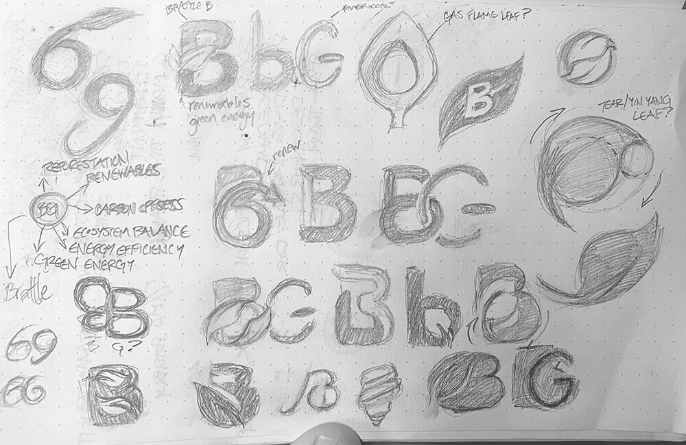
Concept Sketches — Things can get pretty messy in this phase
Execution
Eventually, we landed on a leaf resembling one part of a yin-yang and decided to explore that approach. Since the yin-yang itself represents a cycle of renewal and balance, the built a leaf with it as a model, keeping its direction on the upswing. In this way, the leaf symbolizes the renewal of life and, more specifically, plant life and reforestation. This lends itself to the forest management project from which Brattle purchased its carbon offsets. It was then blended into a circle emanating from the base of the capital B. If you were to draw the shape of the B with the leaf, it creates a cycle turning in on itself, which reinforces the design of the recycling symbol.
Additionally, the G in Green was modified to resemble a power icon rotated 90 degrees. This helps tie the logo to elements of energy consumption and how our daily energy use, whether it’s with lighting or fuel, plays a fundamental role in climate change.
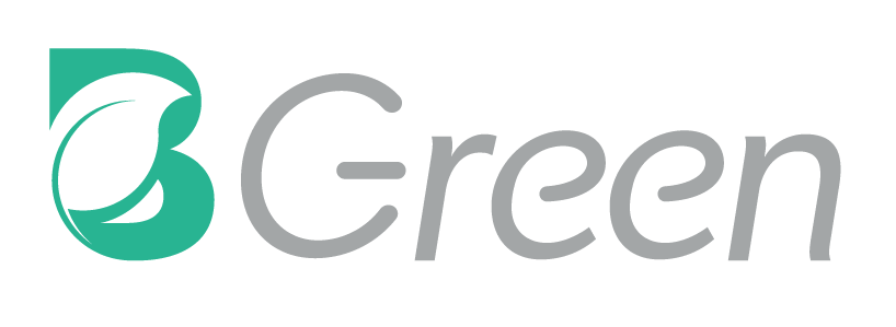
Full Logo — Combining the mark with the rest of the logo type
Final Product
Ultimately, the BGreen team and I were excited to present this new look for the initiative. We made stickers to celebrate the new logo, which were then distributed by local BGreen Reps! Below are the final brandmark and logo, showing placement guidelines and applications on light and dark backgrounds.
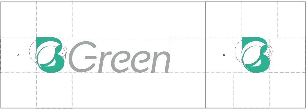
Logo Guidelines — Keeping things lined up tight
Logo Light — Application on white background
Logo Dark — Application on green background or imagery
join the discussion
Let's connect
What do you think about the results of this new visual identity for Brattle’s BGreen initiative? Send me a note using the form below. I’d love to hear your thoughts!